Walk into any room painted deep red and notice how your pulse quietly quickens — that is the meaning of colors working on you before your conscious mind even registers it. Color is one of the fastest signals the human brain processes, and its influence on emotion, decision-making, and perception is well-documented across psychology, neuroscience, and design.
Why color affects us more than we realize
Researchers in environmental psychology have consistently shown that color changes how people estimate time, judge temperature, and even assess the taste of food. In one widely cited study, participants drinking wine from a blue-tinted glass rated the flavor as lighter and more refreshing than the exact same wine served in a red glass. The wine had not changed — their perception had.
This happens because color carries deeply embedded associations built over a lifetime of experience and, in some cases, evolutionary history. Our ancestors associated red with blood and ripe fruit — both high-stakes signals. Green indicated safe vegetation and water nearby. These links never fully disappeared; they just moved into the background of everyday experience.
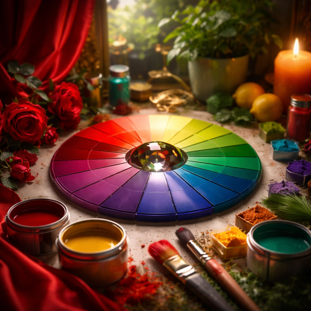
A closer look at individual colors and their psychological effects
Each color carries a distinct emotional profile, though context always plays a role. The same blue that communicates trust on a bank’s website can feel cold and clinical on a restaurant menu. Below is a breakdown of commonly studied colors and the associations they tend to evoke.
| Color | Common psychological associations | Typical use context |
|---|---|---|
| Red | Urgency, energy, passion, appetite stimulation | Food branding, clearance sales, warning signs |
| Blue | Trust, calm, reliability, focus | Finance, healthcare, technology |
| Yellow | Optimism, warmth, attention-grabbing | Children’s products, caution signage, fast food |
| Green | Balance, growth, health, safety | Organic products, wellness brands, environmental causes |
| Orange | Enthusiasm, creativity, affordability | Retail calls to action, sports, budget brands |
| Purple | Luxury, wisdom, spirituality | Premium cosmetics, confectionery, wellness |
| Black | Sophistication, authority, elegance | High-end fashion, technology, editorial design |
| White | Cleanliness, simplicity, space | Medical, minimalist design, wedding-related |
Culture shifts the meaning entirely
One of the most important things to understand about color symbolism is that it is not universal. White is worn at weddings across much of Europe and the Americas as a symbol of purity and new beginnings. In several East Asian cultures, white is traditionally associated with mourning and funerals. Neither interpretation is more correct — they simply reflect different cultural frameworks built over centuries.
Similarly, green carries positive environmental connotations in Western markets, while in some Middle Eastern contexts it holds strong religious significance tied to Islam. Red is a color of celebration and luck in Chinese culture, yet it signals danger or financial loss on stock market displays in much of the Western world.
Color does not have a fixed meaning — it has a context. The same hue can comfort, alarm, attract, or repel depending entirely on who is looking at it and where.
This is particularly relevant for anyone working in international branding, interior design, or cross-cultural communication. Choosing colors without researching your audience’s cultural background is one of the most avoidable mistakes in visual communication.
How color theory connects to real-life choices
Color theory — the study of how colors relate to one another and how they are perceived — gives us a practical framework that goes beyond decoration. Understanding complementary colors, warm versus cool tones, and color saturation helps explain why certain combinations feel harmonious while others create visual tension.
Warm tones like red, orange, and yellow tend to feel stimulating and advance visually — they appear closer than they are. Cool tones like blue, green, and violet tend to recede and create a sense of distance or calm. Interior designers use this principle constantly: painting a narrow hallway in a cool, light tone makes it feel wider; painting an accent wall in a deep warm color makes a large room feel more intimate.
Before choosing colors for a space, outfit, or design project, ask yourself three questions: Who will see this? What do I want them to feel? What cultural context are they coming from? These three questions will filter out most poor color choices before they happen.
Color in everyday personal decisions
Beyond design and branding, color perception shapes personal choices in ways most people never consciously examine. The color of packaging influences whether a product feels premium or budget. The color of walls in a workspace affects concentration and mood throughout the day. Even the color of a plate has measurable effects on how much food feels satisfying.
People also use color deliberately in personal presentation. Wearing navy or charcoal to a job interview is not a random choice — it signals competence and stability. A bright accent color in an outfit draws the eye and communicates confidence. These are not rigid rules, but they reflect widely shared color associations that operate subtly in social interactions.
- Light blue and soft green in a bedroom support relaxation and better sleep quality.
- Bright yellow in a kitchen can feel energizing in the morning but overwhelming over long meals.
- Deep navy or charcoal in a home office is associated with focus and professionalism.
- Earthy tones like terracotta and warm beige create a sense of groundedness and comfort in living spaces.
The gap between knowing and applying
Understanding color psychology is only useful when it informs actual decisions. The most common mistake is treating color associations as absolute rules rather than tendencies. Red does not always stimulate appetite — in a fine-dining setting with dim lighting, it can feel romantic and intimate rather than urgent. Context, lighting, saturation, and combination with other colors all modify the final effect.
The practical takeaway is not a list of rules to memorize but a habit of observation. Start noticing how different colors make you feel in physical spaces, on screens, and in the products around you. Over time, that observation builds an intuitive fluency with color that no chart or formula can fully replace. The science gives you a starting point — your own calibrated attention takes it the rest of the way.